Post by Mike
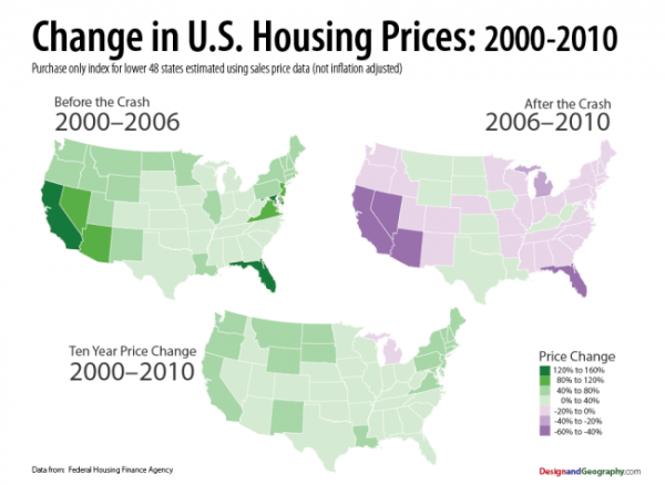
Here is an interesting chart that shows Georgia as being relatively stable as far as values are concerned. Before the crash in years 2000-2006 the state was in the 0-40% price change range. After the crash 2006-2010 we are in the -20-0% range, and for the 10 year period 2000-2010 we are still positive in the 0-40% category.
No comments:
Post a Comment